Sunday, February 16, 2014

Product Review: The Pebble Smartwatch


After my mediocre experience with the second generation of Sony Smartwatch, I decided to wait for better smartwatches to come out. After seeing the ridiculous Galaxy Gear with its pitiful 16 hour battery life and the Cookoo and Citizen Proximity ignoring the fact that Android has Bluetooth 4.0 support, I decided to buy the Pebble.

Truth be told, I've had my eye on the Pebble for a while. I almost bought it earlier, but videos of it made it look clunky and slow. It's really not. I almost went for the extra hundred dollars and bought a Pebble Steel, but after looking at the specs, it was no better than the regular version of Pebble except with a flashier presentation.

First off, the Pebble's body is a rectangular thing which immediately stands out. I've already gotten several comments about it just based on its appearance. For me, it's just the right size for my wrist. Someone smaller and the watch might overhang, but most people shouldn't have any issues with it. It comes with a silicone strap. Some might find this a bit cheap, but it's really very comfortable to wear. I haven't really worn a watch in years and I find myself missing it when I take it off.

The right side of the Pebble's body is devoted to three buttons: up, down, and an OK button (probably as best it can be described). The left side of the body contains a back button and the charging port. The Pebble uses a magnetic clip with a USB cord. This is the only other item in the box besides the watch. While it is a non-standard charging method, you can't really fault it that much since in order to achieve 5 atm for the watch, it had to be sealed completely. Since it is 5 atm, you should be able to go swimming or use it in the shower. However, I have not yet since I'm a bit leery about taking expensive electronics near water. Maybe in the future I'll see how it works.

The Pebble uses an "e-paper" display, however it's more a transflective LCD than what you might see in a Nook. I doubt the Pebble can maintain an image on the screen without electricity like true e-paper technology does, but I digress. The screen's resolution is 144 x 168 giving it a pixel density of 139. It's certainly not crystal clear and monochrome, but this isn't some super watch. For what the display looks like and what the watch does, it's certainly passable. It's easily readable in daylight and it has a nice feature that a quick flick of the wrist turns on the backlight for night time reading.

So what can it do? Well right now, Android is still waiting for the launch of the Pebble App Store, but the basic uses of the watch are to receive notifications (from your Calendar, Gmail, Email, Facebook, Messaging app, and more), control your music, tell time (obviously), use the alarm, and reject or accept calls. The Pebble is limited to a combination of eight watch faces and/or apps. Still, I was able to load a calendar app onto the Pebble and I've seen other apps for things like using the watch as a speedometer for biking, Google Maps, and a few other programs I don't use.

A sample of an email sent to the Pebble (not my arm).


Overall, I've found it's use very good. I often run around at work with little time to check my phone in the instance of an important message or notification. With the Pebble, the watch gives me a pleasant vibration and the message remains on the screen until I dismiss it with the back button. In the instance of multiple notifications, you scroll through them with the up/down buttons. Multiple dots at the top of the screen indicate how many notifications you have. I'm not sure how many it can store before it is full so someone with more knowledge feel free to chime in on the comments section. When not in a notification, scrolling with the up/down buttons changes with the clock faces.

Another plus is clock faces can be animated (at the cost of battery life) and every thing is done through the Pebble control app. Syncing with the phone was fairly painless on both my Nexus 4 and 5. I believe I only lost connection one time so far in the two weeks of owning it. In addition to helping the pairing process, the Pebble control app also allows you to download a few new watch faces by the company that makes the watch, test notifications to determine how they work, adjust which music player the music command controls, choose which programs can send notifications, act as a go-between for third party apps, and update the firmware. Updating the firmware is easily the nicest part of it as it doesn't require any technical knowledge or wired set-up. Everything is done through the app wirelessly.

Battery life is pretty decent for the watch. I was hoping for a little more than I got, but it managed to eek out five days on the first charge and about five on the second as well. When the battery is getting low a battery icon appears at the top of the screen in the menu section (it never shows in the clock faces to remain unobtrusive). More daily notifications, animated clock faces, and using the backlight and alarm will drain the watch faster obviously. Charging from the computer tends to take about an hour to an hour and a half, but is not too long.

So are there any downsides? Well a little. Navigating with the scroll buttons can be a bit of chore depending on the notification, battery life could be a bit better, and there needs to be more storage for apps. Also, notifications like emails that contain images and HTML show up as code. So those kinds of notifications you'll be grabbing your phone to figure out what's in it.

Still, for all that it does and the story of its origins (the Kickstarter is still the highest funded project on the site), the Pebble is actually a triumph. It's a smartwatch cheap enough for anyone to purchase and useful enough to not regret buying it. It's still got some growing pains, but it's obvious from recent firmware updates, the Pebble Steel, and the app store that the company is dedicated to taking this smartwatch all the way. I recommend it for anyone considering a smartwatch, but remember it's not a do-all kind of watch. Instead, think of it as a notification hub and control center for your phone.

The Good: Comfortable to wear, screen is visible in all conditions, maintains good connection, all updating and app transfer done wirelessly, backlight gesture is a great idea, water resistant to 5 atm, not too costly.

The Bad: Battery life could be a bit better, scrolling larger notifications can be annoying, limited app storage.

Final Grade: B+  

Monday, January 6, 2014

Rapid Review vol. 2

I'm taking a break from a little fiction writing to do a rapid review. Sometimes new isn't always better. A lot of times a newer product comes out and changes way too much about what you love about a product line. Sometimes a newer product does like Apple and doesn't introduce enough new features to be worth your time. A lot of what I buy are the last generation products going on clearance or at extremely cheap prices. Sometimes I buy things brand new if they're really worth it, but most of the time I'm either too poor or too pragmatic to bother with new products. Here's a few things I've picked up recently (and not so recently):

UE Mobile Boombox - Cost $50


Ultimate Ears is a subsidiary of Logitech, after they were purchased by the company in 2008. The successor to the Logitech Mini Boombox, UE Mobile Boombox is a upgrade in several different areas. Compared to the Mini Boombox, it's a little bigger in pretty much all dimensions, but that's owing to a different design. 

The design of the Mobile Boombox has been simplified with a rugged rubber exterior and simple three button system, which is just volume controls and a Bluetooth button for pairing. Gone are the touch sensitive controls on the top that were prone to scratching. However, in the process because of this, you'll no longer be able to control the tracks from the speaker itself. Such is the sacrifice of a modern design.

Still, the unit does sound pretty decent. Because of the larger body design, sound is not as treble heavy as before. Things are a little more balanced with the mids being more pronounced. Bass is about the same as before, which is to say, not much. Even though it lacks bass, the unit is so portable and cheap you can hardly fault it for not being on par with a Bose unit or other competitor.

A couple of other features worth mentioning are a change from NiMH to Lithium-Ion battery. This will make standby times and off times much longer. Lithium battery have much better drain times when turned off than NiMH as I have pointed out before. As before, speaker phone capability is still here. Also, a change from mini-USB to micro-USB will help charging as any standard charger for Android or Windows Phone will do. (The unit does come with its own charger and cord.) Overall, worth purchasing, but pay no more than I did at $50 as the Bluetooth speaker market is saturated.

Pros: Durable redesign, micro-USB charging, change to Lithium Ion battery, sound remains decent.

Cons: Loss of track control on top of unit.

Final Grade: A

Philips O'Neill The Stretch headphones - Cost $30-$70


My favorite headphones are a pair of these. The O'Neill brand of Philips are a high end style of headphones that don't get nearly enough praise. Finding them in stores these days is pretty much near impossible with the likes of Monster, Bose, Beats, and every other brand you see nowadays, but you can still find them on eBay for a pretty low price.

First off, these are some of the most comfortable headphones I've ever worn. I can wear these things for hours with no discomfort whatsoever. I'm a fan of over-the-ear headphones for their noise cancelling properties and these do the job admirably. They have no dedicated noise cancellation, but close off your ears enough to do a more than satisfactory job.

Sound quality for the unit is impressive. We're not talking super high end and audiophiles may not take away the best experience, but the average user is going to find them great. Most of the sound is balanced, but bass will appear weak without some equalizer settings on your system of choice. In fact, one could say the sound is too balanced. You'll need to work with your equalizer settings depending on what type of music you listen to so you can find optimal quality. However, once you find the best balance for your personal taste, they sound excellent.

Finally, build quality is phenomenal. The main piece connecting the headphones is made out of vinyl instead of plastic or metal so it's virtually indestructible. Seriously, I've tried twisting it into tons of shapes and nothing breaks it. You also have a woven cloth-like cord with a break point near the headphones so accidents don't tear the electrical wiring, but just detach instead. These are an excellent buy that I thoroughly recommend for those wanting a higher end pair of headphones without the higher end cost. Only drawback is they are somewhat large and don't fold so they're best suited to home use, plus they lack a mic so you're using these only for listening.

Pros: Extremely comfortable, indestructible build quality, balanced sound.

Cons: Don't fold up so best suited for home use, no optional mic.

Final Grade: A-

Thermos Element 5 Hydration Bottle - Cost $20 - $40


A non-electronic review? Sure. I'm a on the go kinda guy and I like to carry some iced tea along with me. I spent a great deal of time pouring through various bottles going hit and miss. I landed on one bottle made by Thermos that was nice, but a design flaw had it leaking every time I took a drink. 

Now there are a ton of thermos type bottles out there, but many have sipping tops meant for coffee. Since I'm not a hot beverage kinda guy, it took me a lot of time to find this bottle. After browsing through eBay and the web, I came across this guy.

First off, there is absolutely no leakage at period. The design of this is very rugged. From its stainless steel construction with hard plastic on bottom and top, it's about as durable as you can make it. A nice feature of the bottle is a loop with a carabineer so you can attach it to a backpack or even your belt loop if you want. 

In terms of insulation, I can say with certainty it holds up to its claim of 24 hours for cold liquid. It's rated for 6 hours of hot liquid, but as I haven't drank anything out it, I'll just assume its probably right. The opening for liquid is more meant for cold liquids anyway. The only thing I wished was the bottle held a little more liquid. At 22 ounces it's on the larger side, but I've had ones that were 24 ounces or more so it would be nice, but for the money you can't buy a better thermos built for life's travels.

Pros: Durable, no leakage, carabineer for hooking to other items, cold insulation lasts as advertised.

Cons: Could be a little larger, opening for drinking is better suited for cold liquid.

Final Grade: A

That's it for this post. I'll be back sometime soon with more.


Tuesday, December 31, 2013

A review of Android 4.4.2...

Been away for a while. There's not been a lot of time to review things nor have I had much to review. I'll probably have another rapid review soon, but for the moment, let's take a look at Android 4.4.2.

Note: I skipped over reviewing Android 4.3 because I thought it was really more incremental than essential. 4.3 can be basically summed up as Bluetooth 4.0 LE support, TRIM support, auto-complete in the phone dialer, some minor Bluetooth boosts, a few graphical tweaks, revamped camera app, and a lot of under the hood changes.

Android 4.4 KitKat brings some of the most significant changes to the operating system since Ice Cream Sandwich 4.0. On the surface, the first thing you'll notice on stock Android is the removal of holo blue accents from the operating system. The designers for Android have stated that the holo blue actually interfered with a lot design aesthetics for the system and a switch to a more neutral tone helped bring out the apps instead of focusing on the OS UI.

Personally, at first, I was apprehensive about the change. It took a long time for me to get used to the holo blue theme after becoming enamored with Gingerbread's green. Now, I'm being corralled to another style. Thankfully though, it's actually grown on me due to the semi-transparent notification and navigation bars. At first I thought this transparency would cause issues seeing the clock or buttons, but it didn't prove so.

The only negatives I have with it is there are still some holo blue accents in the system. While the clock, navigation bar, quick settings toggles, and a few others have gone all white, you still have some suspiciously holo blue areas like the settings menu quick toggles for the Wifi and Bluetooth, plus a few random menus. (I will admit, as I'm on a custom ROM, either Google or the ROM developer has taken the time to remove the last of the holo blue accents from my version, but stock ROMs still have it to my knowledge.

This UI polish has also gotten a healthy boost in performance from two areas: memory reduction and better 2D rendering. Project Svelte was introduced in 4.4 to make the OS run smoothly on hardware as low as 512 MB. While you won't see any upgrades to older chipsets outside of custom ROMs, this makes it easy for just about any newer hardware to take advantage of the new version of Android. This is more fragmentation combating to hopefully prevent OEMs from just slapping an old version of Android on their phones and calling it a day.

Smoothness has been enhanced thanks to software vsync that helps predict usage ahead of the hardware vsync and I can attest to its benefits. Much like 4.1 made my Galaxy Nexus feel like a new phone, 4.4 did the same for my Nexus 4. There are a host of technical improvements so if you want to read about them from a former Google software developer, check out this link.

Before I mention any other features, I should mention Google has done a lot this release to shore up consistency. I mentioned in my Ice Cream Sandwich post that the OS seemed all over the place, with certain areas looking different from others. KitKat doesn't have much of this. Some things have been made similar like to add a calendar appointment you get this little clock you punch in your time. This was applied to the alarm clock section as of KitKat. A few other things were made consistent. The font is a little more streamlined, the ugly bold numbers in the lock screen clock and clock app have been made slim, and indicators in the navigation bar on the lock screen help you know to pull up Google Now or go to the camera.

Moving on from the polish of the UI, the most changed thing in the OS is the dialer. The holo theme is almost completely gone here, replaced with a search bar at the top and you favorite contacts when you open the app. You have to push the dial pad button on the bottom to bring up the dial pad with a slick animation. Even on my custom version of KitKat there's still some holo blue in the dialer which shows Google still has a ways to go to remove the overarching theme of the past three releases.

The dialer still has autocomplete like before, but Nexus 5 owners get the extra benefit of being able to search business phone numbers directly from the app and have a internet based caller id from Google Maps. I've tested it out on my phone, sideloading the app, and I can only hope they remove the exclusivity of it and bring it to all Nexus devices. Nexus 5 owners also get the Google Experience Launcher that is basically an extension of Google Now. It does have the nice feature, after installing offline language recognition in US English only, to be able to talk directly to your phone from the home screen and have it search for you. Doing a little sideloading on my Nexus 4 shows it works wonderfully even on my older hardware.

Outside of that, the average user will take note of the wireless printing option in the settings menu. Unfortunately, I can't be of any assistance here, but I'm sure some will find it useful. There's also a Tap and Pay option baked directly into OS that seems to appear when the NFC chip is on. This was likely to stop pushing Google Wallet and put it directly into the OS. Whatever the case may be, I've only been able to successfully use NFC on my phone to pay for something when I had a Google Waller gift card. It never worked with my bank card to my dismay and I've never bothered to try again.

There's a Document app that allows you to view photos, videos, and music. It's basically a stripped down version of a file explorer and I find it a waste. Even the most ad-ridden free file explorer is much better than this so just don't bother. For those with stock Nexus experiences, you'll see there's two gallery apps, one is the old school gallery app and the other is tied into Google+ called G+ Photos. Redundant for sure.

Outside of all this, there is a lot of under the hood changes including APIs for native IR blaster support, sensor batching, step detection, and counters. Immersive mode is a feature that lets you remove the status and navigation bar in apps that you use it. You can get either back just by flicking from the bottom of the screen, but this has to be programmed in. It was first seen early on in the YouTube app which did something similar. You've also got the AOSP browser running Chromium engine instead of Webkit but nobody will notice this outside the support for HTML 5. Stock Nexus devices come with Chrome pre-installed anyway.
Location settings have been separated into high accuracy (which is GPS, Wifi, and mobile networks all at the same time), battery saving (just Wifi and mobile networks), and straight GPS only.

There are a few other minor things like being able to set your default SMS app, but the biggest one that most people won't deal with is the ART runtime. It's a feature buried in the developers section of the settings menu. This alone requires you to go into the status section of settings and click your build number 10 times just to get the developers menu anyway, so this really isn't for the faint of heart.

Basically, ART runtime is the intended future for Android. In the early days of Android (Pre 2.2), things ran pretty crappy on the system and it was sluggish regardless of hardware power. Froyo introduced the Just-In-Time (or JIT for short) compiler. What it did was compile some of the apps code initially to help the app start and then compile what else was needed as you ran the app. Nowadays with high end hardware, JIT is more of a memory hog and a burden than a benefit. ART intends to change this by compiling the entire app from the time of installation (or a reboot when you see the "Android is upgrading" screen) to reduce CPU cycles and memory bloat. It's an experimental feature right now and doesn't work for all apps, but many people have reported getting much better battery life thanks to it. The trade off however, is longer installation times for apps.

Overall, KitKat is great upgrade. It strengthens even the weakest hardware and makes the top-end hardware run great. I can attest that even without ART runtime, I get better battery life and a much smoother performance. Initially, I swore off the upgrade for a while because the custom ROMs were struggling a lot harder to get a stable version going unlike previous versions, but things have come along a lot more smoothly lately. I give KitKat two thumbs up and I think Android is going to be shaped more and more around Google Now in the future.

Tuesday, September 17, 2013

The iMpulse Bluetooth Controller review - A great first generation product

Kickstarter has been something of a curiosity for me. I hadn't backed anything on the site since for the longest time there really wasn't any projects I cared for or were interested in. The first products I heard about which finally piqued my interest were the Pebble Smartwatch and Ouya game console. Obviously, they been completed and both were planning to make it big time with actual retail support so I decided to start browsing around the site.

 Finally, I came across something interesting: the Impulse controller. The Impulse was a tiny Bluetooth controller you could attach to your key-chain. I was interested, but when I found out they had added new functionally in the form of a presentation remote and key finder, I was stoked. I chose the silver metal version for $45 and placed my pledge in November of 2012. Nine months later and a host of emails involving its progress, I received my controller. I thoroughly recommend you look through the Kickstarter page and its Updates section as it shows the process of how the controller came to be and what it takes to manufacture something like this. A great read for those interested in how our electronics are made. There is also a home page for the controller which is like the Kickstarter page, but significantly simpler and less cluttered.

Unfortunately, there was manufacturing defect with the first controller. I contacted tech support for Black Powder Media and they sent out another controller with apologies. The second controller, another of the full metal variant, failed. I was discouraged, but I offered the company to pay for another replacement. This time I chose just a plastic version. The company obliged at no cost to me, impressing me with their concern. Thankfully, the defect seemed to be in the batch of full metal variants and not the plastic one and I was in business. Ultimately, my device failure helped the team as they have told me they traced the issue and future controllers should not have the problem mine had (the technical term is oscillating frequency failure or in basic terms, my phone couldn't find the Impulse).

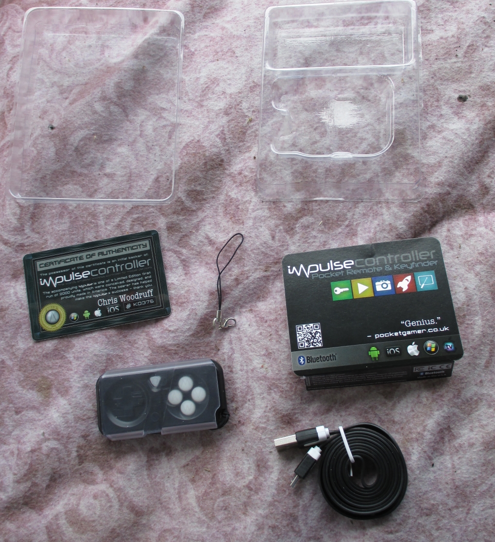
The packaging for the controller is economic containing only the controller, sleeve, lanyard, charging cable, and the small cardboard slip for the label. My version contains a certificate of authenticity for purchasing the metal variant.

The package for the Impulse controller as you would receive it (lanyard will not be attached like mine is).

Contents of package: Impulse controller with sleeve, charging cable, and lanyard. (Certificate of Authenticity is only for Kickstarter pledges).
Overall, the controller itself is not much bigger than the key fob for my car. The triangular button and four face buttons light up. On the back, you have the two triggers with the front four-way button having plus and minus signs for presentation mode. Pairing the controller is simple. Merely holding the triangle button for four seconds puts the controller into pairing mode where I quickly found it in my Bluetooth settings.

The sleeve protecting the controller also functions as a stand for your phone or tablet. However, I would not advise using it for tablets due to the weight. It did work great for my Nexus 4 though. It also has a spot resembling the triangle button on the sleeve, which makes it easier to determine which way the controller goes in.

Front view of the controller. 

Rear view of the controller. The tiny hole acting as the "dot" in the web address is actually a reset button you can do with a paper clip.

My certificate I received for pledging the metal variant of the controller.

Charging cable.

The Impulse sleeve. Note the triangle button pattern at the top. This indicates which way the controller should go in.
After you connect the controller, you can download the optional Impulsify program, which serves as an instructional manual and testing for the buttons on the controller. A second and important program for Android is the Find My Impulse program. This program only works when the controller is not connected which happens when it sits too long idle or the triangle button is pushed to lock the buttons. Once activated, the controller beeps loudly allowing you to use it as a key finder. There was an occasion where I had to trigger the alarm twice in order to make it work. My only guess would be the controller was sleeping and had not fully “waked up.”

A screenshot of the Find My Impulse program. This is all it is. Simply tap the screen and it sets off the alarm on the controller.

The Impulsify program which serves as a manual, game recommendations, and testing program for the controller.
The controller’s ergonomics are not bad actually. Although not as comfortable as my Red Samurai controller, the Impulse still works in a pinch. The first thing I tested it on, obviously, was emulator support. My favorite emulator, SuperGNES, works nearly flawless. The only minor quibble I had was the lack of a button for Start/Select. I opted to use the on-screen buttons for this, but hopefully a future revision of the hardware will add another button since there is enough room for below the triangle button. Some games though are tougher to play due to the small size of the controller. Playing Legend of Zelda: A Link to the Past where free form moving is easy, but another puzzle game like Tetris or Zoop required more fine point control and this is where I had some difficulty with it.

Unfortunately, outside of the basic functions and emulator support, the controller lacks gamepad support that was built into Android 4.0+. Even some of the games listed by the Impulsify app do not work properly. Granny Smith only worked partially. The directional pad could control her cane, but her jump did not work on any of the buttons. However, Black Powder Media did release an API that developers could implement to use the controller with games not working right now. They have also told me through my contact with them they are going to provide a firmware update to customers at no charge, which will enable gamepad support in the future.

As far as battery life goes, the Impulse goes the distance. Black Powder Media opted to eliminate any circuitry to check the battery and this allowed them to double the battery life of the controller. The controller will warn you when you are down to about 3 days or so standby by blinking four times. You can fast charge it for 10 minutes and get a few more days or go the distance and do two hours for a full charge.
I have so far been using the Impulse on and off for about a week and have yet to see the low battery indicator light up. The company says the battery life under standby conditions will be about three to four weeks. I imagine sporadic use of functions with standby will last probably about two weeks, which is very solid.

Outside of a lack of gamepad support and an additional button, the only thing bothering me about the controller was the lanyard. The lanyard seems weak and could easily break depending on circumstance. Upon contacting Black Powder Media, they told me the itself should be very strong, enough to actually break the plastic of the controller. What would break would be the metal clasp, but the company kept this considering it is better for it to break away as opposed to the plastic loop on the controller.

Overall, the controller is spot on and it does just about everything it said it was supposed to with the minor exception of gamepad support. While the controller isn't going to be as comfortable as a full size one, it still works when you just want to play for a bit like in a waiting room or on the bus. The basic black plastic version is going to retail for $25, which is a solid deal considering it costs about as much as a basic Bluetooth headset and does a whole lot more. This first version may have a few minor negatives, but it should not be of any consequence when purchasing and future versions will likely iron out any issues. You can pre-order a controller on the store which should ship sometime in October 2013. 

Final Grade: A-

Pros: Lightweight and small size, great battery life, multiple functions, great for key finding and emulators, sleeve is great for protection and a stand for your phone, gamepad support with firmware update.

Cons: Lanyard clasp is a bit weak, could use one more button to help emulators.

Update: Black Powder Media released a firmware update for the controller through their website. This instructions are simple to follow and the result gives gamepad support to the controller. I can attest that it works after testing games like Grand Theft Auto III with it.  

Sunday, September 1, 2013

Accessories and Android - A terrible relationship

Unfortunately, I don't have any products to review at the moment. Times are tough and money is down. Even worse though, there's really nothing to review. Android has always been treated like a red-headed stepchild when it comes to accessory support. Some of the things I have managed to purchase like my Philips charging dock are really one offs. Seriously, go look in store for some docks with audio capability for Android. Find any? Yeah, didn't think so.

I've found a few things here and there, mostly online. There's a Rock Dock from T-Mobile that I didn't know about, but it's pretty bare bones. Of course, the now discontinued Philips Fidelio line of docks are available on eBay for cheapish now. There are quite a few docks that actually exist, but unless you're familiar with eBay and some Google research, you may be getting something good or something horrible. More to the point, in store shopping is what I'm really getting at. There are occasions where I can only find something online, like a discontinued item or import item, but I typically like to do my shopping in store to ensure I'm getting something good.

Now, do the same thing with Apple. You'll find at least a dozen docks in store from an equal amount of manufacturers. It's depressing to say the least. Apple does do something right and that's create a consistent product across generations. Aside from the 30-pin to lightning port change, one dock will work for just about any Apple product from the iPhone to the iPad to the iPod.

But why shouldn't it for Android? Although Android doesn't have audio out through the charging ports like Apple, you figure there would be some market for these type of things. 99.9% of Android phones use micro USB and everyone charges their phones right? They all have Bluetooth. So why aren't we seeing more of these things? Surely, the dreaded fragmentation word isn't in play considering Apple is just as fragmented these days.

Another example: I really like Citizen watches. They have something called Eco Drive which allows them to be powered by light. They never need a battery. It's a wonderfully amazing product line. Recently, they came out with a watch called Proximity. It uses Bluetooth 4.0 LE and is basically a low-end smartwatch with notifications and out-of-range function for your smartphone. However, read their site and Citizen states they have no Android version of their control program in the works. Really? In fact, you can't even find the watch on the official site anymore.

Another cool smartwatch that I really want is the Cookoo smartwatch. Similar to the Citizen one, albeit much cheaper and requiring basic watch batteries, Cookoo doesn't appear to have anything in the pipeline for Android. There was a beta version that works for exactly one phone: the Samsung Galaxy S4. So, if you don't have that phone, you've got a basic watch that would only cost a fraction of the $130 asking price. This is even after Android 4.3 brought Bluetooth 4.0 support a month ago and their app was just updated two days ago so certainly someone is working on something.

With about a billion devices out there, every one in seven people have an Android device. Yet, companies seemingly refuse to give the platform any accessory support. It's a sad notion indeed that even with raw market dominance across the world, manufacturers aren't willing to get behind Android for anything that isn't a case (and even that can be iffy, just try to find quality cases for the Nexus 4 among other phones). I can only hope as Android grows more unified and less fragmented (as it has been doing so lately very rapidly) manufacturers will start to embrace the platform and really give it some good accessories. I certainly hope so anyway because I'm damn sure not switching to Apple.

Friday, August 16, 2013

A powerful tablet at a rock bottom price - my Hisense Sero 7 Pro review

I recently decided to buy my son a tablet for his birthday. Unfortunately, money has been fairly tight lately, so I needed to keep my tablet purchase under $200. I searched through dozens of tablets from various manufacturers to different sizes, specs, and price points. Finally, I chose the Hisense Sero 7 Pro and here's why:

A look at the hardware itself

First off, a look at the physical appearance itself. The closest competitor in more ways than one is the Nexus 7 (2012 model). The Sero 7 Pro (S7P for short) is just a little taller and wider, but about the same depth. The S7P eschews the soft touch backing of the Nexus 7 for a much cheaper textured plastic. Most stock pictures show the back as being silver, but the reality is it's more of a copper or grayish-brown color. It's weight is certainly heavier, but that's because it packing several different features (more on that shortly).

On the front you have your all black bezel and 7" 1280 x 800 resolution screen with a 2 MP front facing camera near the upper right. The right possesses the power button and volume rocker key. On top, you'll see the microphone, microSD, headphone jack, and mini HDMI port. Finally, the back has the stereo speakers (which are amazing loud and clear, by the way) and 5 MP camera with flash.

Overall, it doesn't quite hit the build quality of the Nexus 7, but it's passable. You can feel the inside is a little hollow, but the back cover doesn't have that much give to it. I could not find any information about whether the screen is using Gorilla Glass and I'm not inclined to damage my son's new toy so be wary. 

What's inside the tablet

Internally, it's specs are almost identical to the Nexus 7. It packs the same 1.3 GHz quad-core Tegra 3 with 1 GB of RAM. It has all of the normal things you would expect from a 2013 tablet which includes Bluetooth 3.0, Wifi in a/b/g/n styles (both 2.4/5 GHz compatibility), NFC, GPS, light sensor, etc. Where the S7P differs from the Nexus 7 is in the following: the S7P actually has vibration (something I mentioned on my Nexus 7 review) and 8 GB of storage compared to the 8/16/32 GB that the Nexus 7 had. 

The tablet comes with Android 4.2.1, and while it's a couple of updates behind, it's certainly not far out of touch like some products. Hisense has taken the minimalist path and there are very few modifications to the OS. There's a screenshot button on the navigation bar and a power saving mode toggle. That's about it. The tablet is bundled with a few pieces of bloatware, but surprisingly, most of them can be uninstalled. You're going to need it because out of the 8 GB of storage, only 5.2 is available to the user after formatting, installation of the OS, and whatever programs you can't uninstall.

Performance is very good for the tablet though. It performs on par with its counterpart, the Nexus 7. Reaction time is snappy and animations are smooth. For the most part anyway. The tablet still suffers the RAM bottlenecks that the Nexus 7 had. This is largely due to having only 1 GB of RAM and the slower clock speed on the RAM when compared to more modern chipsets like my Nexus 4.

One severe defect I noticed was for some reason, trying to use the "power saving" mode in the power saving menu caused soft reboots. Soft reboots are where the OS is still loaded and just basically restarts. They're quicker than a full reboot, but they're still indicative of a problem somewhere in the code. I've switched it to balanced and haven't suffered any more of them lately. 

The battery for the tablet is a 4,000 mAh Lithium Ion which comes in a bit smaller than the larger one in the Nexus 7. Still, during operation the battery holds up well and likely meets the claim made on the box of 10 hours. Standby time, however, falls short. Over the course of 12 hours, the tablet lost probably around 8 percent of its battery where my Nexus 7 only lost half that. Bear in mind, my Nexus 7 is running a custom ROM and kernel so this may impact its battery life. Still, depending on use, you'll likely charge it every other day unless you turn it off between uses. 

The camera bears mentioning since the original Nexus 7 only included a 1.3 MP front facing camera and the S7P includes both a 5 MP rear and 2 MP front. Unfortunately, camera quality is average to below quality depending on location. The rear camera activates with an audible click when starting up the app. Shots outdoors with the rear camera looked passable when scaled back, but zoomed in you can see jagged edges and grainy details everywhere. 

Camera performance

Shot taken of my car with rear facing camera in daylight.


However, the front facing camera suffered poorly, even more so than you would expect for a 2 MP camera. Images lack detail, suffer jagged edges, and have a cloudy, hazy effect to them.

My ugly mug testing out the front facing camera in daylight.

Indoors, the formerly passable quality really takes a hit on both cameras. The rear facing camera looks sufficient for basic images, but the noise on the photo is really turned up here. Also, in darker circumstances, the flash and focus sometimes get a little off leading to unusable pictures.

Taken in my son's bedroom, Bearry the bear seen posing. Using rear facing camera with no flash.
Front facing photos inside are completely worthless without sufficient light. A shot taken again in the same room with a florescent light and some natural lighting from behind looks cloudy, lacks detail, and has the same obvious noise that the rear camera had.

Myself, barely seen in this bad photo from the front facing camera.

If you're taking photos outdoors in the daytime, you should be fine with the results, but for anything else, you're better off grabbing your smartphone or point-and-shoot camera. Bear in mind, while this is 4.2.1 on the tablet, it lacks photosphere in either camera, if you're into that sort of thing.

Conclusion

On the whole, it's a very good tablet for its price of $129 exclusively at Wal-Mart stores. While the 5.2 GB of usable space might be a no go for some people. You can still supplement that with a microSD card. I've yet to test the mini HDMI port so I'll have to do an update on this in the future. Some of the features in the tablet, like haptic feedback, were pleasant surprises I didn't expect. Overall, if you're not trying to keep up with the Joneses then this tablet will suit you just fine. If you're looking for a more updated software experience then the Nexus 7 (2013 model) is a better choice for around $230-270. Hisense has stated they will update to 4.3 in the fall, but only time will tell. They have sent out a minor update which was basically just some bug fixes and under the hood type stuff. If you're looking for premium, well, you'll be going with the iPad Mini at $329+ depending on model. For comparison's sake, you could get 3 Sero 7 Pros for the cost of one 32 GB iPad Mini. Your mileage and opinions may vary on which is the better deal.

In closing, I think the Sero 7 Pro is a very good bargain for its price. It's not for the spec hounds or tech heads, but any regular joe will find considerable value out of this package. If you have any questions, post them in the comments section below.

Pros: High end specs for a cheap price, decent build quality, Android 4.2 installed, more features than the Nexus 7 (2012 model), good performance.

Cons: Inferior camera performance, minor reboots when using power saving mode, only about 5 and a half GB user space.

Final Grade: B+


Sunday, August 4, 2013

Motorola Moto X: Overhyped and Under-delivered


So it's finally arrived, the much vaunted X phone that has been rumored since shortly after Google purchased Motorola. For the last two months or so, a constant flood of rumors and leaks have taken a lot of the thunder out of the reveal. Much of the hype came from the customization rumored for the phone. However, ultimately, there just isn't much to be interested in.

Let's just start off with the phone itself. The Moto X borrows a lot of design cues from its main rival, the LG Nexus 4. Overall, the basic shape is the same. The X is slightly shorter and not as wide which makes the screen dominate the phone and eliminates a notification light. The back, however, has a rounded shape which according to most people who've played with it, is very comfortable to hold. 

Internally, the Moto X comes with the X8 processor system on a chip designed by Motorola. It claims to have two CPU cores, a natural language processor, contextual processor, and a quad-core Adreno 320 GPU. The reality is it's just a modified Snapdragon MSM8960T. It does have more similarities to the Nexus 4's S4 Pro APQ8064 and the newer Snapdragon 600, but let's not kid ourselves here: there's nothing revolutionary about the phone's specs. Everything else is merely passable in the smartphone wars: 720p screen, full compliment of modern versions of things like Bluetooth and GPS, 2200 mah battery, etc.

So what's the big deal? Well, the customization, camera, and software modifications. 

The customization early on was rumored to be like what we have with laptops and PCs: the ability to adjust nearly everything internally such as processor, RAM, storage, etc. What we got was the ability to choose a backplate, accents, frontplate, engraving, and a few minor things like wallpapers. That's it. Is it awful? No. It's a step in the right direction towards moving other manufacturers to make more customizations, but it's not the same level of customization that the computer market has.

The camera is supposed to have Clear Pixel technology which is a sensor that allows more light for better pictures. On paper, it looks like it will, but I'll need to see comparisons in the future to determine if this is true. The software mods are somewhat interesting, but nothing revolutionary. The big things were "always-on" microphone that allows you to talk the phone like you would Google Glass without even touching it, capitalizing on the AMOLED screen technology to deliver notifications, and the quick gesture to open the camera. That's it. Everything else is pretty much stock Android 4.2.2. Not even 4.3.

So overall, the phone does break a little new ground, but it's really more against other manufacturers than something the consumer should jump for joy over. I'll admit, it is a good step in diversifying yourself in a market flooded with Samsung and Apple. 

The biggest problem isn't the phone itself, it's the usual politics that follow it. Motorola isn't going the Nexus route initially and selling on the cheap. It's going through the carriers which under normal circumstances is fine, but we're seeing exclusivity again. AT&T will get not only the phone first, but the option for Moto Maker first to customize your phone (the phone without customization is 16GB and black or white only). The Galaxy S4 was such a huge hit not just on specs or recognition, but due to the fact that it was available on every carrier at almost the exact same time with no exclusivity to it. 

Even worse, Motorola expects consumers to pay $199 for an on contract price. This leads most to believe that off contract prices are going to be near $600. Aside from the exclusivity and the fact that it may take time for Moto Maker to trickle out to the general public, this is largely the issue that's going to make or break the Moto X. The general consensus on the web is that the Moto X just isn't a high end phone. It has no specs that meet or beat the current high end market. This combined with the fact that it is competing directly with the extremely cost friendly Nexus 4 is going to lead to disaster. Motorola says an unlocked Google Play Edition and a "cheaper" variant will be coming soon. The big question is: what are they going to reduce from an already mid-range spec device to make it cheaper and why should the public bother?

If there's one more nail in the coffin, it's this: the Moto X is only going to be available in the USA. Yep, Motorola's big comeback is only going to be available to a market of 300 million people as opposed to the 7 billion that are on the planet. 

In short, Motorola is marketing the experience as opposed to the hardware. That's right, they're trying to take a page from Apple on this one. The problem is they don't have the rabid, backbone following nor the charisma. This is only going to spell disaster for the company. Although jingoistic notions of "assembled in the USA" are heartwarming to say the least, Motorola is marketing to a virtually non-existent following who live in America, will buy anything American, and have way too much disposable cash. Good luck finding all those customers, even with the $500 million advertising Google is going to funnel you. Hopefully, they'll learn from their mistakes on this one and do better next time...if they're still around. We all know how Google likes to give the ax to projects.